Soundtrack:
I wanted to do a more “normal length” piece in between my two-part epic on AppLovin and a forthcoming, also two-part epic on Bluesky, and I so thought I’d talk about the simplest way I know to determine if I am looking at potentially useful analysis.
Truly useful analytic outputs should make you feel, in something like equal measure, two different ways perfectly encapsulated by two rhyming phrases that are fun to say:
“Oh shit!”
You say this out of surprise, because when first looking at the analysis, it is immediately apparent that new and interesting information lies therein.
“No shit.”
You say this because there are elements of the analysis that quickly register as unsurprising to you.
You may be wondering why this is a good thing-if you already knew things, than wasn’t the analysis kind of a waste?
Well, when SOME of the information is not news, this can be a good thing.
We all have heuristics in our heads we automatically and subconsciously run every piece of analysis through immediately upon seeing it, and if alongside a bunch of sirens going off and a shrill voice screaming “THIS IS NEW! THIS IS WEIRD! THINGS ARE POTENTIALLY CHANGING!” there are some soothing elements of normality, it helps us to resume a mode of rational thinking a little more quickly than if nothing is familiar.
Then, when we’re communicating this information, it has the same effect on the people receiving our message, which is obviously beneficial.
Lee Elliott’s Patent Pending Quadrant of Shit

Can’t wait to get a job teaching this at Harvard Business School.
As you can see there are four zones that pretty much explain themselves and tell you how useful what you’re look at is.
Let’s take a look at this in action. In fact, let’s look at the analysis I did that so embodied this principal that it inspired me to write about it.
The Business In Question
To anonymize this, let me just tell you that we’re talking about a business you have to physically take yourself to in order to use it, in very car dependent parts of the country.
It could be fast food or a big box store or whatever you want to imagine in that vein, anything works.
Here’s an inelegant, mostly-encompassing map of the business’s locations:

I am not a cartographer, and Google Maps sucks at actually displaying all locations of a given thing once they’re spread out over a certain distance with significant gulfs of emptiness between where the thing is present.
As you can see, being spread through all the main population zones of Texas, the southwest, some of the Mountain West, and both northern and southern California, they’re in markets that are remarkably different across a lot of different parameters.
Demographics, population density, urbanity/rurality, climate; the list of ways in which some of these places are dramatically different than others could go on and on and on.
The business had a fundamental understanding that this was important, but in analysis and action and systems design for their digital offering, it seemed to kind of be something just considered ad hoc and addressed as needed when solving any given individual problem.
To make a long story short, we thought the root of the best work we could do for them, quickly, started with market analysis aimed at identifying which of these locations were sensible to cluster.
How Many Clusters?
Understanding how much “Oh Shit!” vs. “No Shit” happened in an analysis starts with your baseline expectation or hypothesis.
We expected a couple possible fail states:
The approaches used recommend an absurd amount of clusters because there’s no detectable similarity in the markets, and we just pick a number of clusters that is operationally feasible and see how the fit is, expecting the fit is bad.
The approaches used don’t recommend breaking the markets out into clusters at all, and so it’s a useless analysis unless we have to later defend against someone else suggesting market clusters.
I took two approaches that are pretty standard and easy to do thanks to battle-tested Python libraries that already exist.
Diving Into a K (Means) Hole
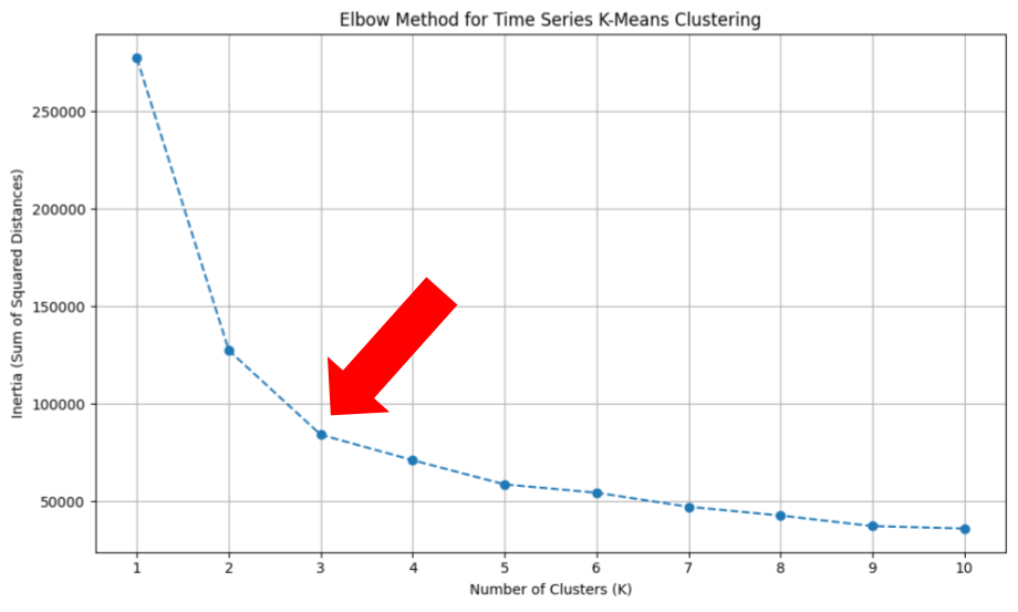
The first is a K Means cluster, which is also the method I would use to get my first idea of how many clusters make sense, as there’s a process for doing this baked right into K Means.
The cluster number analysis is called the Elbow Method, since you’re essentially looking for what looks like the elbow if you imagine the curve as an arm.
Here’s where the fusion of “Oh shit!” and “No shit!” begins to happen.
This output has a healthy dab of “Oh shit!” because this is actually a really nice looking K Means Elbow and it suggests a numbers of clusters that’s very feasible to deploy across analysis and activation for this business.
Going back to my hypothesis, I was actually surprised it didn’t suggest a bonkers number of clusters, or show no similarity gain drop off from cluster one, or otherwise form a strange and unworkable shape.
The “No shit.” also begins to build here. While these markets seem disparate and difficult to work into groups of places a layperson would ever call similar, when forced to consider there is a solution in three or four clusters, my brain started to percolate a bit.
There’s maybe, more or less, three or four different temperature zones, or precipitation zones, or a combination of both. In the population size and density of these markets, I could see there being three or four tiers between the Megalopolises at the top and large-towns-cum-small-cities at the bottom.
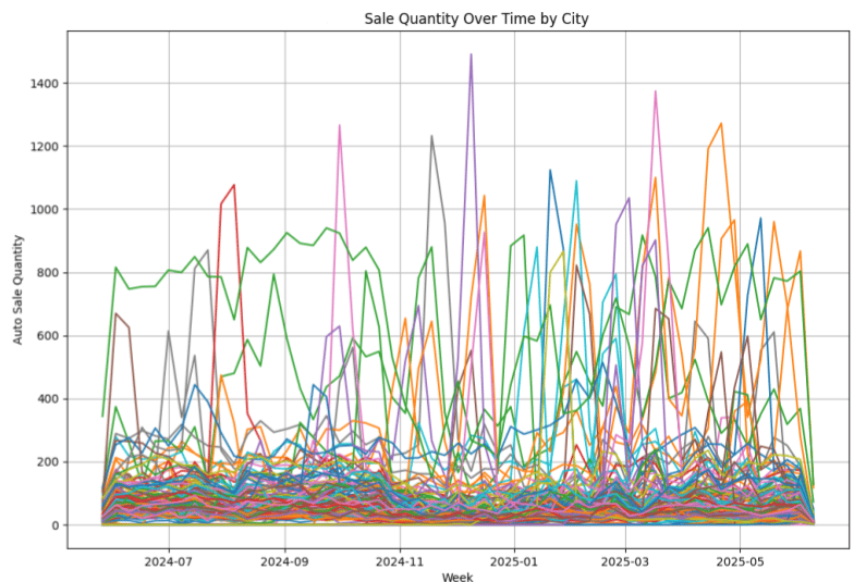
In addition to a soothing narrative, when the sales trends in these market clusters are graphed, compared to the image of all markets, you can begin to see some order coming out of chaos.
Here’s all the markets’ sales figures over time:

That’s some sweaty spaghetti
And here is sales over time in the three clusters that K Means built:

This graph highlights the value of managing things like ad spend, and measuring things like sales growth, independently in all of these clusters, which clearly have been subject to some differentiated trends. Over time with more data, this would likely normalize into graphs that have slightly less severe distances, but where said distances are increasingly meaningful.
The Map Could Become The Territory
I also ran a Self-Organized Mapping algorithm against the “mathematically correct” number of clusters to examine, which in this case is 64. That would not be feasible to actually use, but the idea here was to see how much SOM agreed, or disagreed, with the K Means cluster number of 3-4.

I sunk my Battleship.
There’s three strong clusters in row 2 at the bottom right, and then a lot of mess, suggesting there’s perhaps some agreement here if it’s tenable to this model to shove a large long tail list of markets into a third or fourth cluster, alongside two or three actually sensible ones.
So I forced that by re-running it with four clusters specified, instead of the “proper” 64:

A fourth nipple has hit the mathematical chest.
Okay, okay; the ideal output would have been all four clusters at basically the same color, or three very similar and one slate white (a throwaway cluster, basically) but this is fine, models disagree and my job as the person running them is to sort it out.
This is a fine start to my principal, but the “Oh shit!” and “No shit!” really all started hitting when I exported what the actual clusters were.
To get more “Oh shit!” and “No shit!” in your own life, I highly recommend subscribing to this newsletter:
The Actual City Clusters
Let’s look at a similar cluster both methods put out that’s a short list of mostly larger cities:
K Means Cluster #1: Corpus Christi, El Paso, Houston, Sacramento
SOM Cluster #1: Corpus Christi, Houston, Sacramento
Agreement on Houston, Sacramento, and Corpus Christi being in this group between both models is nice to see, and a small disagreement on putting El Paso in there is fine.
Here’s where the first “Oh shit!” happens: one thing I expected was that a short list cluster would simply be the largest cities, population wise, among all the markets, and so the human-interpretable takeaway here would be that it simply thought the most similar markets were the largest, most urban places.
But here is Houston, away from San Francisco and Los Angeles, paired with modestly sized Sacramento and Corpus Christie. I would not have intuitively done this.
Now let’s look at one of the larger messy middle segments:
K Means Cluster #1: Amarillo, Angleton, Aransas Pass, Brownsville, Clinton, Colorado Springs, Edinburg, Fontana, Grand Terrace, Harlingen, Jurupa Valley, Laredo, Lewisville, Logan, Manteca, Mapleton, McAllen, Monument, Oakley, Orem, Palmhurst, Pharr, Phoenix, Placerville, Richmond, Ripon, Roseville, San Antonio, San Bernardino, Spanish Fork, Spring, Surprise, Tulsa, Victoria, Washington
SOM Cluster #1: Amarillo, Anaheim, Brownsville, Cathedral City, Citrus Heights, Colorado Springs, Corona, Eastvale, Elk Grove, Folsom, Fontana, Grand Terrace, Harlingen, Hayward, Jurupa Valley, Katy, Lancaster, Laredo, Lewisville, Lodi Marina, Mesa, Moreno Valley, Murrieta, Orem Perris, Phoenix, Rancho Cordova, Richmond, Riverside Rocklin, Roseville, San Lorenzo, Stockton, Sugar Land, Surprise, Vacaville, West Sacramento
It’s a lot to look at but here’s what a quick spot check told me: this is hot, dry territory in cities both large and small, across multiple states, with the exception being Colorado Springs in both models, and one major suburb of Houston in the SOM cluster.
With more background on the business than I can give you, clustering markets with this type of climate makes a lot of sense, which is the “No shit!” element.
The “Oh shit!” element is that just sifted through these cities and categorized them by eyeball and hand, I don’t think I ever would have concluded that I needed to gather up all the hot and dry zones, but only between certain specific population density levels, clump the smallest desert towns with LA, and put SF and the Mountain West together, which is what these mostly did when you step back and look at every cluster in detail.

You won’t find any pearls of wisdom unless you’re willing to crack open a few oysters. Actually, those kind of look like mussels. Okay, you won’t get any meaty info unless you’re willing to flex some mussels. In case these are clams: you can’t have a nice Casino if you aren’t willing to clean some clams. Is anyone getting any value out of these images and captions? IDK.
And yet, looking at the whole thing, there’s also plenty of “No shit.” Just clusters that generally make sense and can easily be translated into a nice, neat narrative for my story-loving human brain.
Well, maybe 80% of the analysis makes sense that way.
The hard-to-parse 20% is maybe where more data, and more analysis, is needed to refine the model.
This Is Only The Beginning
You’ll note that I said I use this to determine if I am looking at POTENTIALLY useful analysis, and in this article I am describing situations in which you’re initially reacting to early work on a problem.
Obviously, long term analysis of anything complex involves a lot more than a single guiding axiom can offer.
Validating whether or not the analysis is useful involves measurement and tracking and re-analysis and process review over time to ultimately validate or invalidate your findings.
However, in my life I have saved a lot of time by deciding not to go to deep into a particular rabbit hole, or quickly identified what might be a really high priority analysis project, using this simple “Oh shit!” and “No shit.” symbiosis.
I hope maybe it’s helpful for some of you, too.
If it’s not, feel free to tell me to eat shit.


